tBTC Bridge: Trust design in a Bitcoin bridge→20% conversion.
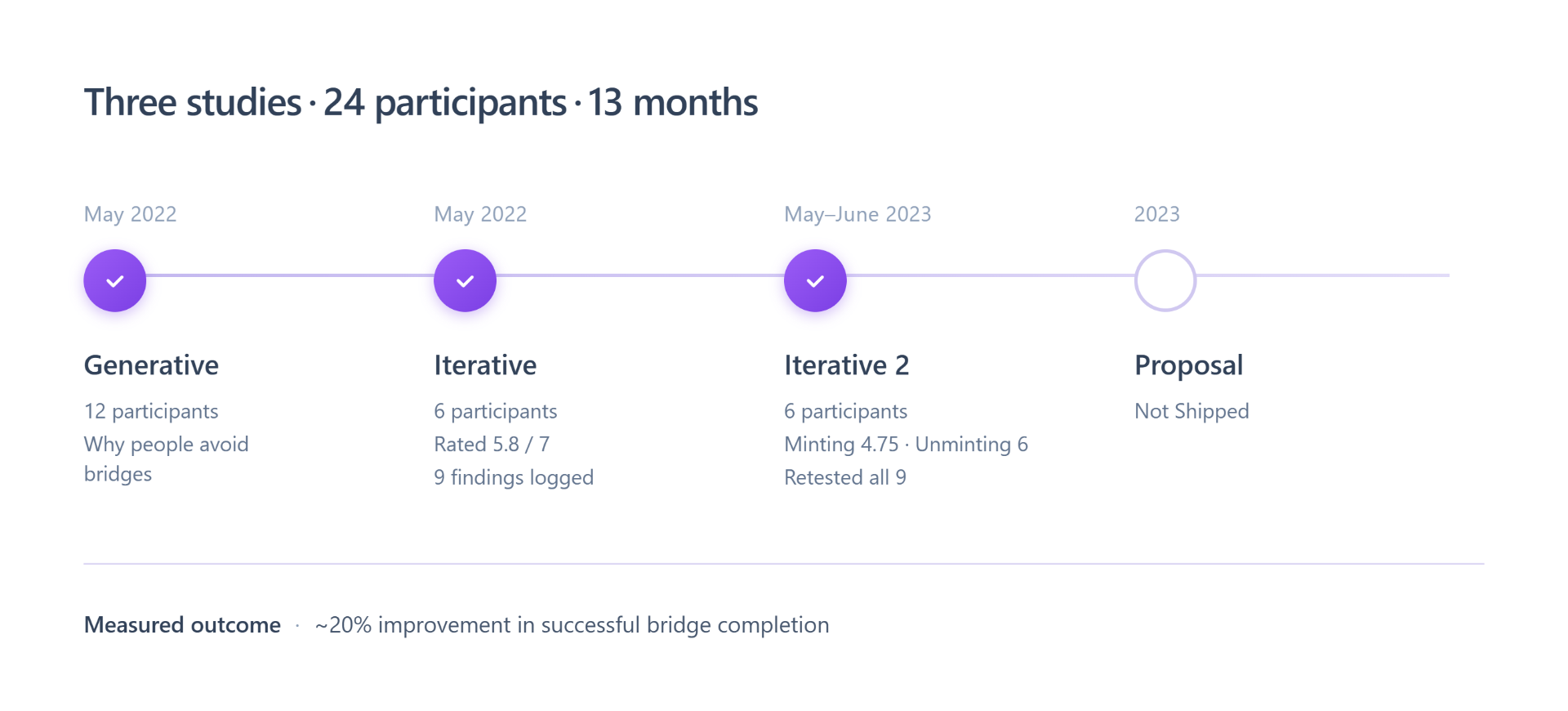
Three studies, 24 participants, three design iterations, and an ~20% lift in successful bridge completion. This is the story of how each one led to the next.
The Problem - Where it started
tBTC v1 - 2019
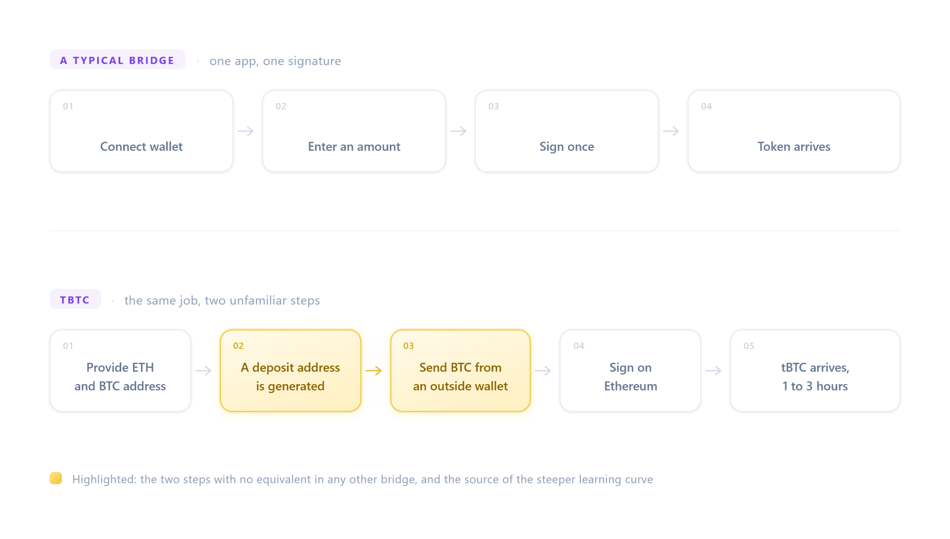
tBTC turns Bitcoin into an ERC-20 token so it can be used on Ethereum. When I picked up the product, v1 had already shipped and already had a reputation problem, and the reputation was earned.
After depositing funds, users landed on a spinner. No states, no progress, no estimate. It could sit there for six hours. People weren't waiting; they were watching a screen that gave them no evidence their money still existed.
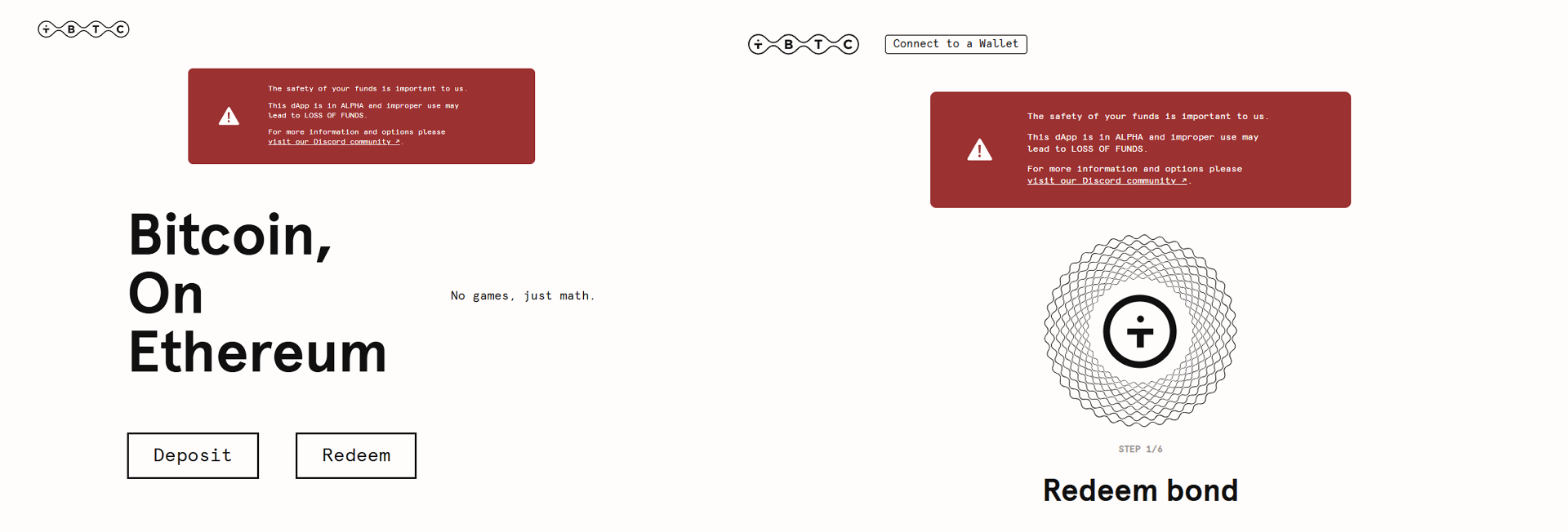
This is about as pure a violation of visibility of system status as you'll find, and in most products it costs you a support ticket. In a bridge it costs you the user. The stakes of that heuristic scale with the stakes of the transaction, and here the transaction was someone's Bitcoin.
Discovery - Understanding the territory before touching the interface
“Sending your Bitcoin to an unknown address is a really scary thing, it’s like a leap of faith.”
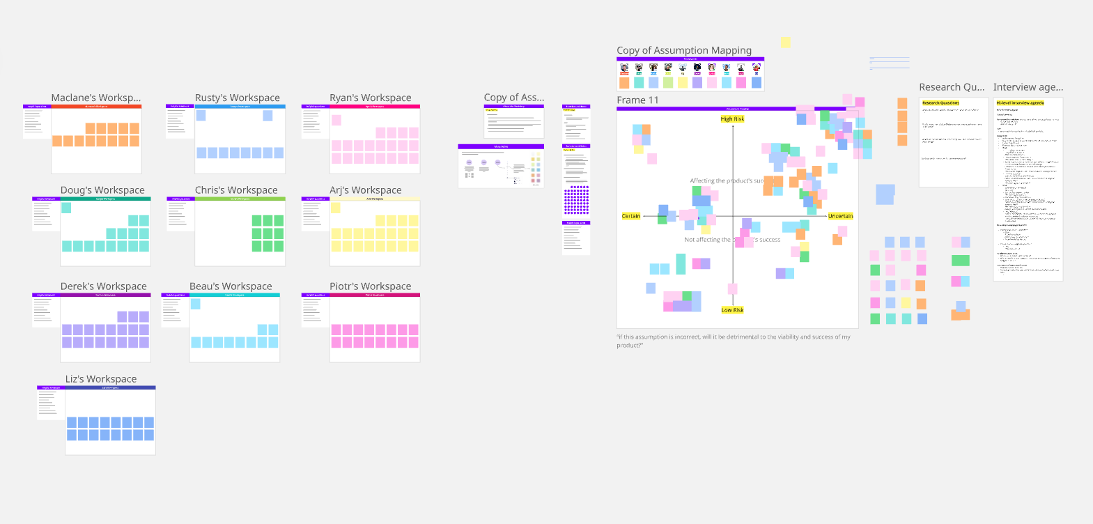
I didn't start with screens. I started with a generative study: 12 participants who held or had bridged wrapped Bitcoin. I did this because I suspected the problem wasn't usability in the narrow sense, and I wanted the team's assumptions on the table before we invested in a direction. We ran an assumption mapping workshop first; the interview guide came out of what we realised we were guessing about.
Three things reshaped how I framed the work.
User - Understanding the territory before touching the interface
The wait wasn't the problem. The silence was.
Participants didn't experience a long bridge as slow, they experienced it as failing. Duration without feedback reads as breakdown. That distinction matters, because you can't design away a wait that lives at the protocol level, but you can absolutely design away silence.
Users' mental model was a swap.
Bridging and swapping had collapsed into one category for most participants. They arrived expecting seconds, met hours, and drew the reasonable conclusion that something was wrong. Some had even built their own workaround: swapping WBTC into tBTC to skip the mint entirely. When users construct a workaround, they're prototyping the product you should have built. I filed that away; it comes back at the end.
Decentralisation persuades nobody on its own.
Nearly everyone described WBTC as centralised, and nearly everyone used it anyway, because liquidity and integrations won. Our differentiator was real but it wasn't a motivator. It was a trust signal, not a selling point.
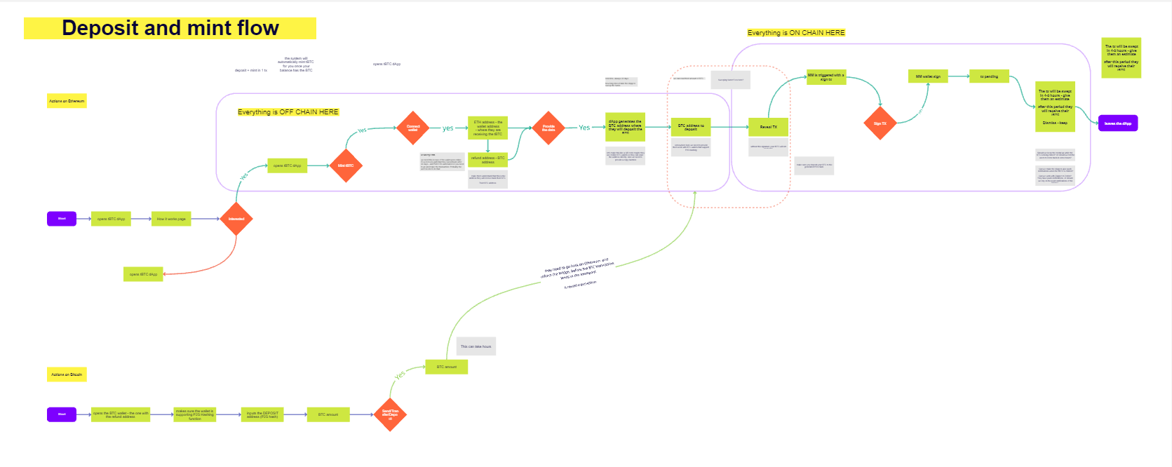
The silent constraintAnd underneath all of it, the constraint: the smart contract dictated the flow. The deposit receipt, the confirmation windows, the order of operations; protocol facts. My job wasn't to shorten the journey. It was to decide what a person should understand at every point of a journey they couldn't control.
First Solution - Iteration 1 · establishing the baseline
Tested May 2022 · 6 participants · think-aloud through minting and unminting flows
I designed the first prototype, then tested it myself. At the end of each session I asked participants to rate the ease of the flow from 1 to 7; the average landed at 5.8, and everyone was asked to motivate their score.
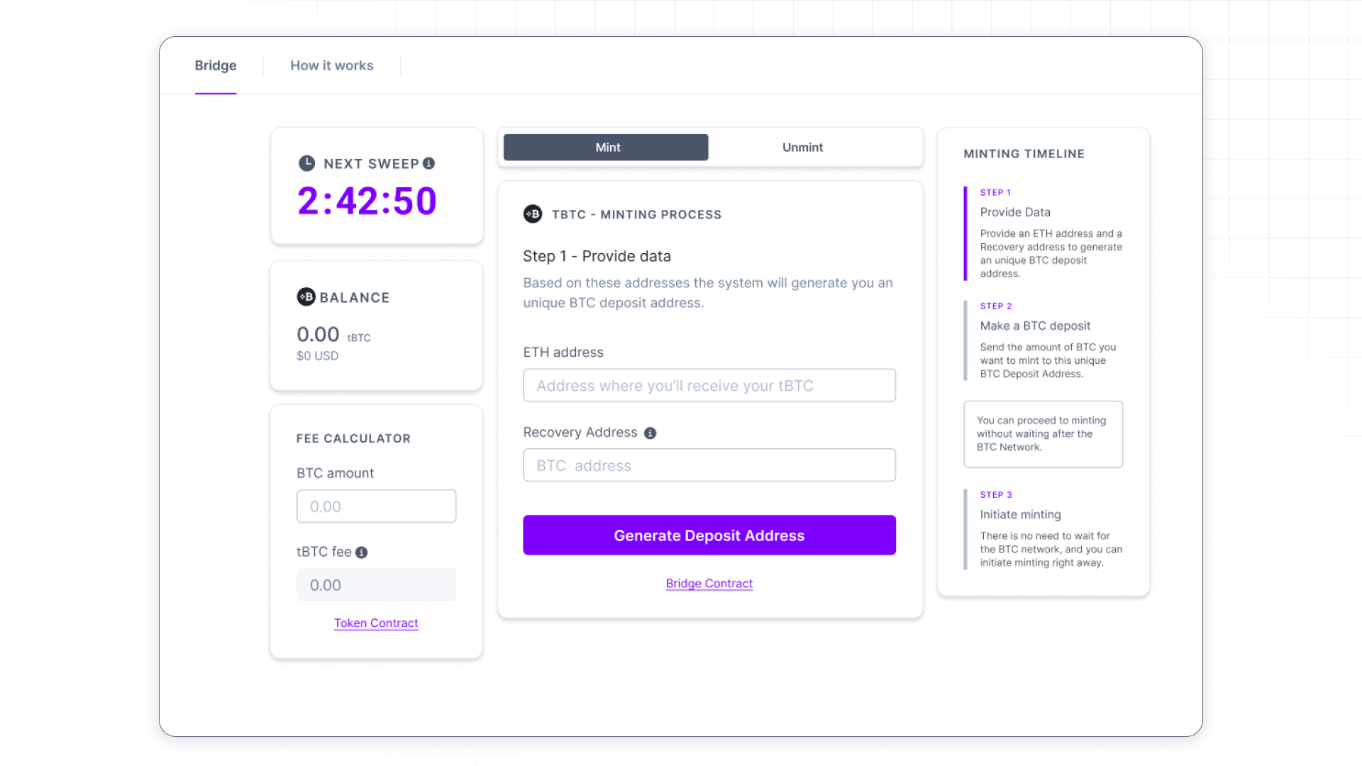
The findings clustered in a way I found more interesting than the score:
- 6/6 lost track of which chain they were acting on. Bitcoin and Ethereum fail differently and cost differently, and the interface never said which one you were touching.
- 6/6 leaned on the step timeline. This was the most-used element on the page, and it was a column of undifferentiated text.
- 4+ "Sweep" meant nothing to anyone. Worse, the countdown attached to it manufactured urgency where none existed. Protocol vocabulary had leaked into the interface and brought protocol anxiety with it.
- 4+ wanted some way of signaling that a mint was in progress, and they also requested a transaction history.
- 2/6 read the recovery address field as an admission: if there's a recovery mechanism, things must go wrong here a lot. Both were v1 users. The ones who'd never touched v1 found the same field reassuring. Same component, opposite meanings, depending on what the user had lived through.
if there's a recovery mechanism, things must go wrong here a lot.
That last one taught me something I've carried since: a safety feature is only reassuring to people who haven't been burned. For everyone else it's a trigger, and you have to design its disclosure, not just its existence.
Second Solution - Iteration 2 · designing the wait
Tested May-June 2023 6 participants
The full research write-up for this round lives here.
At the end of each session I asked participants to rate the ease of the flow from 1 to 7; the average landed at 4.75 for minting and 6 for unminting.
The redesign was organised around one idea: the moment a user initiates minting, their active role ends.
They become a spectator. So the interface should behave like a narrator, mirroring the protocol's actual stages rather than hiding them behind a loader.
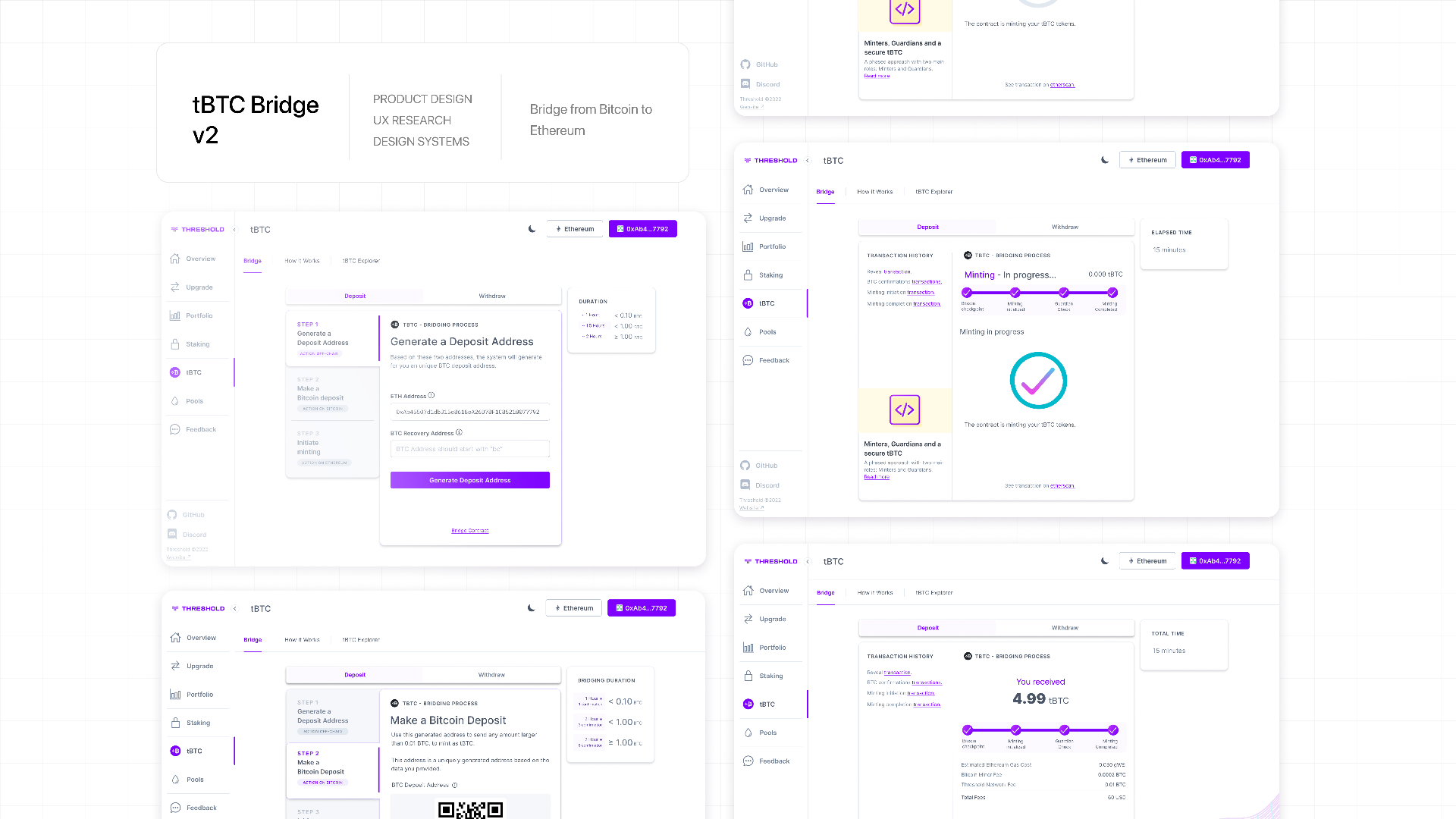
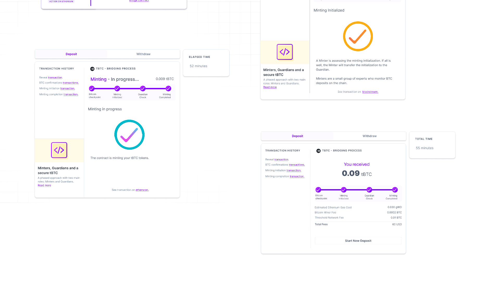
Minting became four visible states: Bitcoin Confirmations, Minter Check, Guardian Check, Minting Complete. Each with a plain-language explanation, its transaction linked on the native explorer, and an elapsed-time counter running throughout.
Visibility of system status, applied literally: don't summarise the machine, show it. The explorer links mattered as much as the states. In crypto, users don't want your reassurance; they want the receipts.
Around that core: "sweep" and its countdown were cut, replaced with a duration table keyed to deposit size, so expectations get set before commitment instead of pressure arriving after it.
Each timeline step got a chain label and a small illustration, giving the timeline the visual hierarchy its usage had earned. The ETH address autocompleted from the connected wallet. Recognition over recall, and no reason to make someone paste a 42-character string we already had.
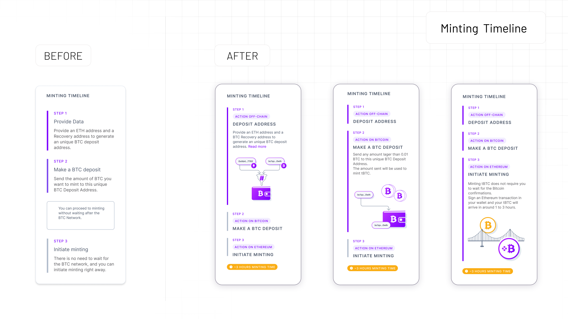
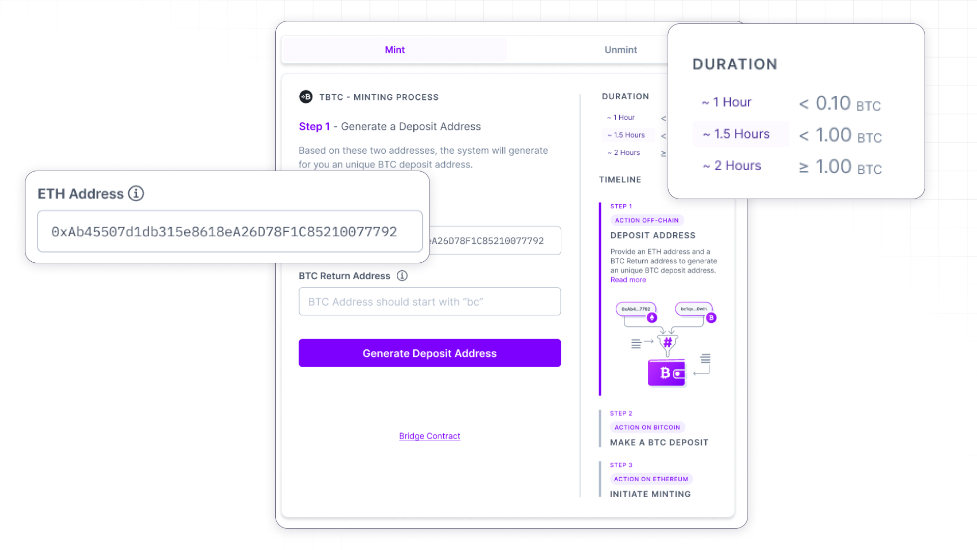
Around that core: "sweep" and its countdown were cut, replaced with a duration table keyed to deposit size, so expectations get set before commitment instead of pressure arriving after it.
Each timeline step got a chain label and a small illustration, giving the timeline the visual hierarchy its usage had earned. The ETH address autocompleted from the connected wallet. Recognition over recall, and no reason to make someone paste a 42-character string we already had.
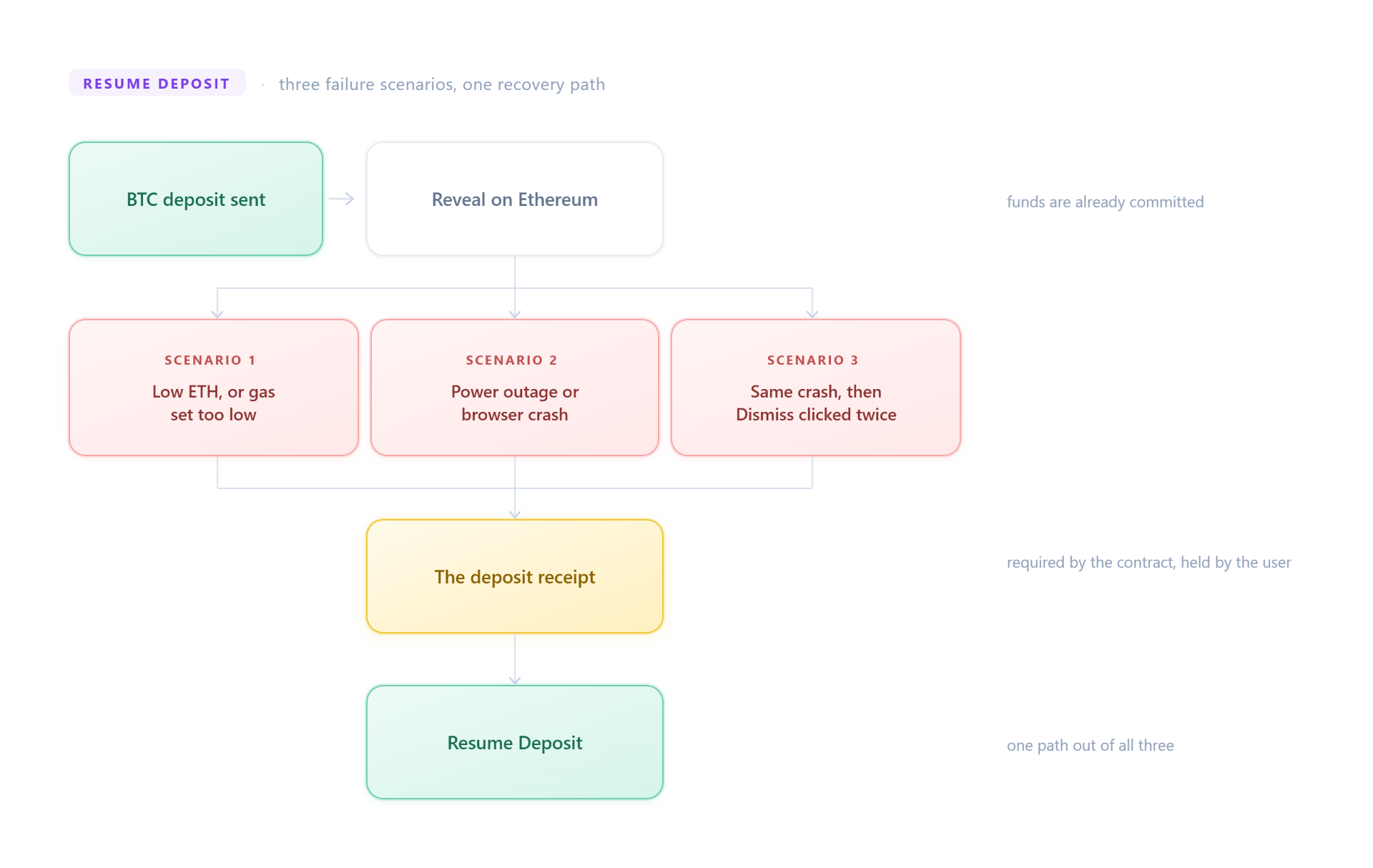
The recovery address became a downloadable deposit receipt with a Resume Deposit flow behind it, covering the three ways a reveal actually dies: gas set too low, a crash mid-flow, or a user dismissing the modal and losing the thread.
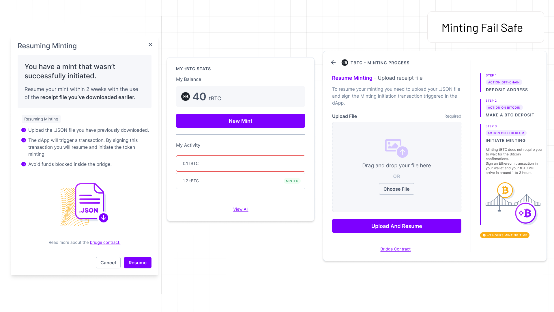
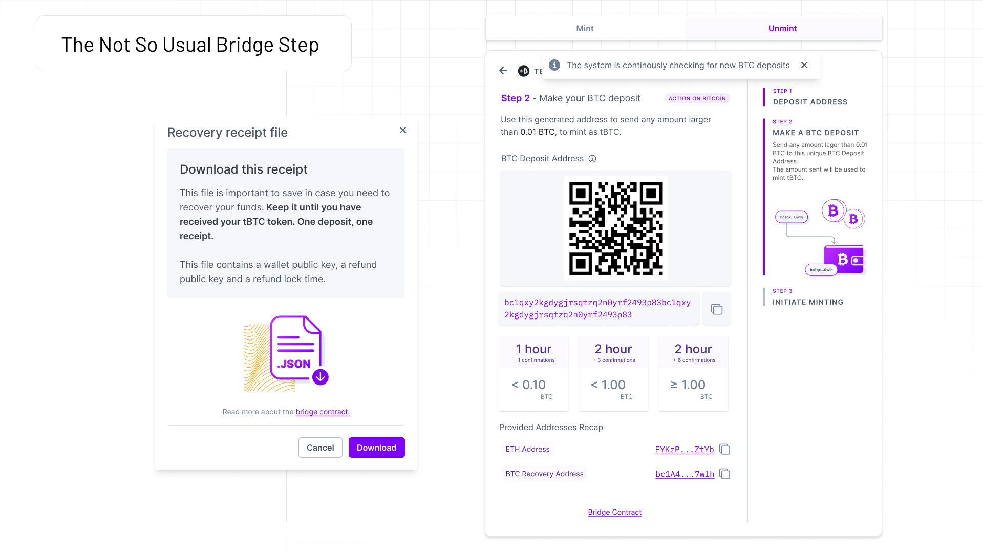
Testing it was humbling in the specific way that's useful. The elapsed-time counter was the most appreciated element in the study, the wait, once narrated, stopped reading as failure.
But the receipt modal frightened five of six participants. I'd solved a two-person problem and manufactured a five-person one. My fix had the same flaw as the field it replaced: it front-loaded worst-case information at the exact moment the product needed to be building calm.
The right answer was progressive disclosure: so I proposed to save the receipt in the dashboard, surface it only when something has actually gone wrong. This fix was added in the final iteration.
Three other fixes had a different problem. The chain labels, the duration table and the restructured How It Works page were all correct, and all of them went unnoticed. Participants walked past information that was sitting right there on the page.
That took me a while to accept, because I had answered each finding on its own terms and each answer was right. What I had missed is that they were placement problems dressed up as content problems. I had been adding information to a layout without asking where attention actually goes in it. People work down the column where the action is, and anything parked in the right rail reads as furniture.
The How It Works page had it worse: it lived behind an onboarding modal that half the participants never got past, so the best explanatory work in the product was gated behind a thing they were trying to dismiss.
The lesson stuck. Adding the right content to the wrong position is indistinguishable, from the user's side, from not doing the work at all.
The Final Solution - Iteration 3
Live in production until 2026, when new leadership reworked the bridge
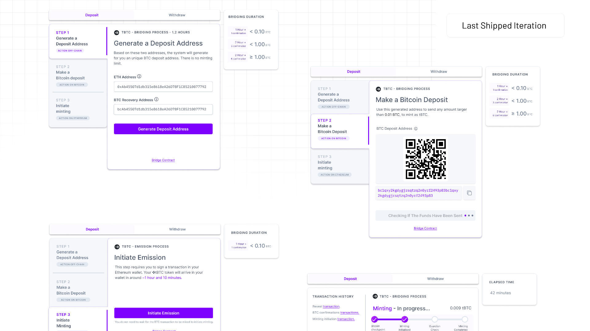
The last pass took the Round 2 evidence and applied it without sentiment. "Mint" became "Deposit", which is match between the system and the real world. Four of six participants never connected minting to bridging, so the protocol's word lost.
Chain labels moved off the timeline and onto the step cards, into the line of reading. The duration panel moved next to the amount decision.
Fees got totalled in USD, which every participant had asked for. The progress bar and time counters stayed untouched, because they'd earned it.
The receipt was saved in the dashboard, surfaced only when something has actually gone wrong.
Outcome.
Completion went up by roughly 20 percent.
My headline UX metric was task success rate, and I triangulated it across three sources rather than trusting any one of them:
→ PostHog, for how people moved through the interface
→ The Graph, for what actually settled on-chain
→ TVL, for whether value was accruing
Between them I could watch the number of new mints, the growth in TVL, and the count of unique wallet addresses touching the bridge, so a lift in success rate was corroborated by real deposits from real addresses rather than resting on interface events alone.
The definition of the metric mattered as much as the number. I only counted a session as a bounce when the protocol had genuinely not registered the BTC deposit, meaning the smart contract never triggered Step 3. That kept the rate honest: someone who completed a deposit and closed the tab was not a failure, and I didn't let a drop-off in the UI count against the design when the on-chain reality said the bridge had done its job.
The pivot: a protocol-mechanism redesign that didn't get accepted
By the third iteration I was fairly sure the biggest problem left wasn't one I could design my way out of at the interface. Across all three studies, the users' mental model never moved: they expected a bridge to behave like a swap, near-instant, and no amount of honest copy about a multi-hour wait was going to overwrite an expectation that deeply set. If the model wouldn't change, the product had to. That's the insight the pivot rests on.
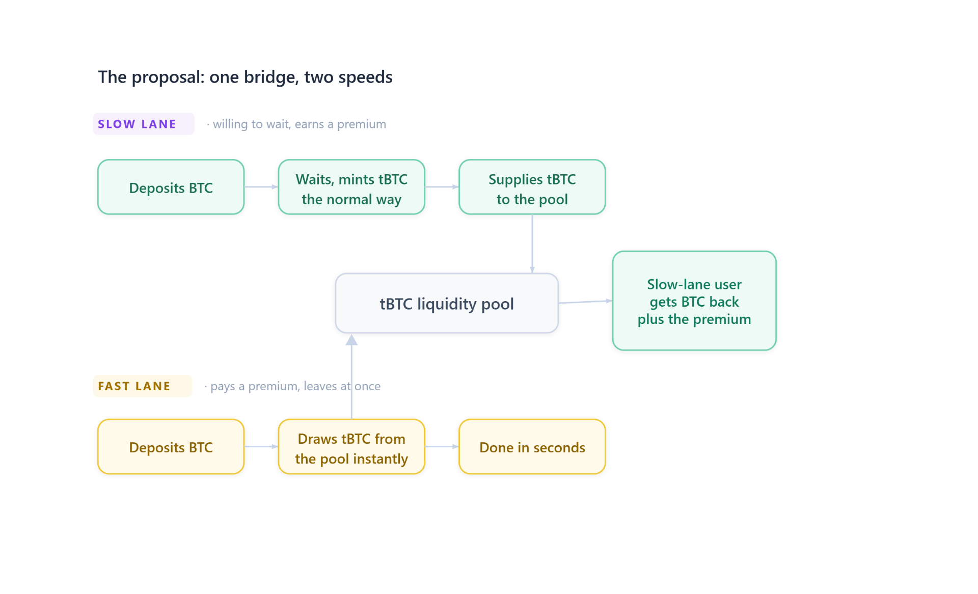
So I proposed a two-speed bridge: patient users mint normally, pool their tBTC and earn a premium; impatient users draw from that pool instantly and pay for the privilege. It wasn't a hunch, either. Users had already improvised exactly this with WBTC swaps, and Hop Protocol was running the same mechanism in production, so the pattern was proven.
I pitched it to the CTO and CEO. It didn't ship. New mechanism, new audits, in the year of the great bridge hacks. I disagreed, but the cost they weighed was real.
Two years later, BOB shipped a gateway on the same economics.
What I took from it
The thing I keep coming back to is that I never solved the problem people thought I'd been hired to solve. The bridge was still slow when I finished. Bitcoin doesn't hurry, and no design decision was going to change that.
What I could change was the story the product told a person during the wait, and it turned out that was the real problem all along. People weren't afraid of waiting. They were afraid of waiting without knowing whether their money still existed. Once the interface stopped going quiet on them, the same wait became tolerable, even reassuring.
That's the lesson I've carried into every project since. In products where the stakes are high and the mechanism is invisible, users aren't really evaluating your features. They're deciding, moment to moment, whether they can trust you, and they make that decision on the evidence you give them: what you show, what you let them verify, whether you speak to them in their language or hide behind your own. Get that wrong and the best-engineered system in the world still feels like a black box you'd be a fool to put your Bitcoin into.
Trust isn't a feature you add at the end. On a product like this, it's the whole job.
Watch the talk this thinking comes from: Designing for Trust in web3
Read the research behind it: generative study · second usability round
Live prototypes: minting flow · unminting flow